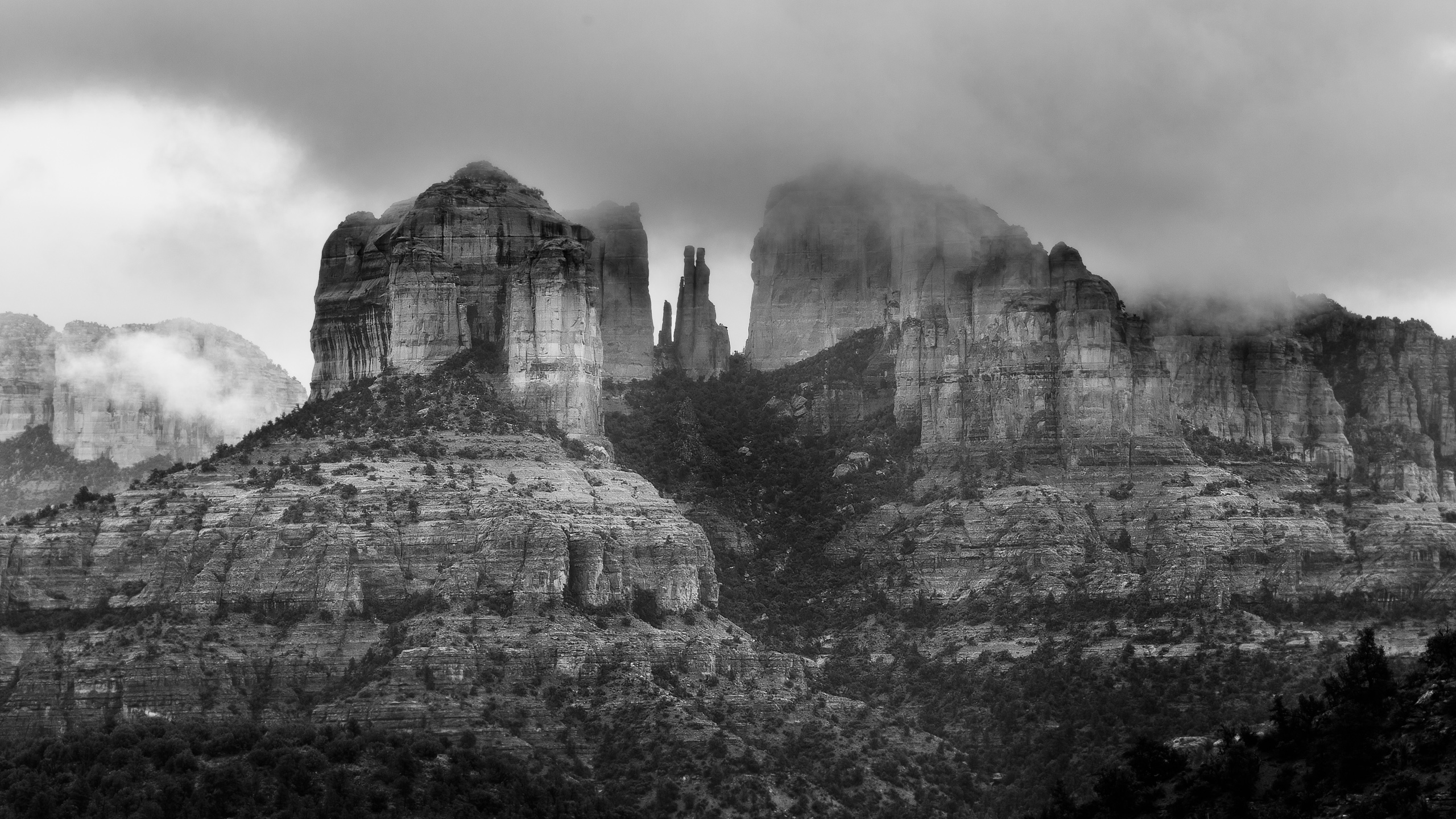
Are there gems in your photo library that were overlooked or rejected? Is there something earlier that you loved and considered finished?
Look again, there may be new life in those older photographs. Over time your style and editing skills probably changed. What’s something you would update? Why did you keep the original? Were you hoping that there was more to draw out? What’s stopping you?
You might decide that now is the time to make a new version of that photograph and apply some lessons learned. In this article, I’ll showcase some photographs that I revisited as black and whites.
Cathedral Rock, 2015

I kept this photograph of Cathedral Rock in Sedona, Arizona from 2015. The scene was good, there was drama in the clouds and it’s an iconic subject. Even with all that, the image just didn’t do anything for me. I recently decided it was time to make a new version of this photograph and as I worked I found myself leaning toward black and white.

I decided what I didn’t like about the original before editing started. There was too much negative space at the top of the frame. The sky above the rocks seemed bland and distracting.
What I did like was the dramatic mist drifting across the peaks. I started with a crop and immediately felt better about it. From there, I added a black and white adjustment layer in Photoshop to selectively bring some tones up and some down. Then I spent some time dodging and burning in the clouds with yet more adjustment layers.
As a result, a new version was a huge improvement. I remembered feeling a sense of awe when I was there in person. Now the photograph evokes an emotion that was missing from the original version.


Done or done for now?

In February 2016, I captured a scene of water cascading down Yosemite Falls that repeated a pattern framing a solitary tree. The initial image was OK, but there was lots of room for improvement. There was a color problem that I didn’t know how to address at the time, but I was happy enough with the photograph and even sold a few prints.
A year later, I started on a new version by adding some contrast to the water. As a result, the drama of the waterfall was more apparent.
As my editing improved, so did the photograph. Another year later the next version had improved color correction, better contrast, selective sharpening and added even more drama. My current favorite version of this photo is a dramatic black and white inspired by Nathan Wirth. Over the past five years, I think I’ve made five versions of this photograph. Each version was “done,” but it was just done for that moment.


Keep making new versions
Apply the lessons you learned as your skills develop. Make another run at those photos in your library that didn’t make the cut the first time. Feel free to make new and improved versions over time.
Source link


Leave a Reply