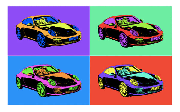
How to Create Pop Art in Photoshop
Pop Art can be defined simply as a form of art based on familiar elements of modern pop culture and media that challenge the usual traditions of fine art. It began as a movement in the late 1950s to blur the boundaries between “high” and “low” art culture and has grown in popularity since then.
The subject matter of Pop Art can include celebrities, cartoons, comic book characters, or just about any ordinary object you can find in your home!
The key characteristics of this truly unique art form include:
- Utilizing recognizable objects
- Extremely vibrant colors
- Dot and line patterns
- Textures
- Humor
You may be wondering, “How can I create a beautiful piece of Pop Art!” So today, I will share a concise and practical step-by-step tutorial on creating Pop Art in Photoshop.
Continue reading and try following along with an image of your own!
Step 1. Take a Photo
The first step, of course, is to take a photo of your object! Try to choose an object with a significant amount of detail and texture, and ensure the object is well-lit, as this will make the upcoming steps much easier.

Step 2. Open Image in Photoshop
Open your image in Photoshop by clicking “Open” and then select your image.

Step 3. Copy the Image to a New Layer
Copy the original image under “Layers” and label the duplicate “Threshold Layer.” Make sure to lock the original image and only edit the additional layers.

Step 4. Adjust Threshold
Next, go to the “Quick Selection Tool” and highlight one small area of the threshold layer image. Then, go to “Image>Adjustments>Threshold” and adjust the threshold bar, so there is a good mixture of black and white, ensuring the detail and texture are visible.
Repeat this for all other sections of the image. Make sure adjacent areas do not contrast TOO MUCH in their mixture of black and white.

After completing this for the entire image, including the background (it should be pure white), lock the threshold layer.
Your image should look something like this:

Step 5. Color Layer
After completing the threshold steps, hide the threshold layer and create a new, blank layer named “Color.” To do this, click on the “+” icon at the bottom of the list of layers.
Click on the blending options dropdown, located right above the list of layers, and select the “Multiply” option.

Next, click on the locked base layer of the image we first uploaded and use the “Quick Selection Tool” again to highlight a small section of the object.
Then, click on the “Color” layer we just created and choose a color. Click on the “Paint Bucket” tool, and fill in the highlighted section. Your image should look similar to this:

Helpful Tips:
- You should use 3 to 4 colors and ensure that each section of the object in a particular color is adjacent to another section in a different color.
- Be creative with how small of a section is filled with each color and where to locate each color for optimal blending.
- Each color should be complementary to the other so they look aesthetically pleasing (many online websites can help you choose complementary colors based on color wheel rules).
- Reserve one color for the background.
- It may help to create a folder for your colors by clicking “Color>Swatches,” clicking on the folder icon, naming it, and then clicking on the “+” icon and inserting each color.

After repeating the steps described above on EACH SECTION of your object, repeat them again, this time for your background.
In the end, your Pop Art should look similar to this:

Step 6. Composition
Repeat the above steps using a variety of different, creative color sets, and then combine the images into a collage!
Here are four different color versions of my object:

Using these images, create a grid collage composition. The collage can be 2×2, 3×3, 4×4, or whatever you want.
To ensure aesthetic balance, try to use the same amount of each Pop Art color version in your collage. The greater the grid size, the more color versions that can be used.
You can keep white space between each color version and/or have a border around the entire composition if you desire, based on your preference for empty space.
I created the Pop Art below using a 3×3 grid and my three favorite color versions from above. Notice how there are three copies of each color version, and they are optimally arranged. For this piece, I decided not to put any space between them.
Hopefully, your pop art collage looks similar to this:

Conclusion
I hope you have learned a lot about this one-of-a-kind form of art. Pop Art is truly fun to compose, and even though it can require a lot of patience to create, it is very satisfying to look at once completed.
Give it a try! It can serve as a refreshing and stress-relieving project!
Do you have any questions or comments about Pop Art and how to make it in Photoshop? Leave us a comment below – We would LOVE to hear from you! And PLEASE SHARE this post using the social sharing buttons (We really appreciate it)!
Source link


Leave a Reply