Open-source software offers alternatives to popular photo editing software without a subscription or even a one-time cost. But, sometimes, there are other hidden costs, like the urge to throw a $3,000 computer across the room. Take darktable, for example. It’s a free Lightroom alternative with many surprisingly advanced tools. But several unnecessary hours and a few weird bugs later, the only thing suppressing the urge to throw my laptop across the room is the little LrC icon in my dock and the fresh memory of just how much the Apple M1 Pro costs.
Subscribers get some sweet perks and are automatically entered into contests!. Download our app for iOS, iPad, and Android and get no banner ads for $24.99/year.
The program darktable (yes, it’s supposed to have a lower-case d) is an open-source application that competes with RAW editors like Adobe Lightroom Classic and Capture One. As free programs, open source apps tend to have fewer updates and typically lag behind in the latest technology. Darktable is no exception. Yet, there are many features that even Lightroom users have to head into Photoshop for, like gaussian blur and liquefy.
While the number of features is impressive, darktable suffers from subpar RAW color processing, a lack of built-in support for camera color profiles, reduced accuracy in local selection tools, a steep learning curve, and a few strange, random bugs. Darktable has many features, but even after learning the platform, many edits will take much longer than other editing apps. If time is money, this free download is actually quite expensive.
The Big Picture
Pros
- Advanced tools like Liquify
- Film-inspired tools like filmic RGB
- Focus peaking makes culling fast
- Customizable workspaces
- It’s free
Cons
- Limited camera support
- No file manager
- RAW processing can sometimes create odd highlight artifacts
- Editing takes longer than other programs
- Local editing is slow and clunky
- Strange bugs
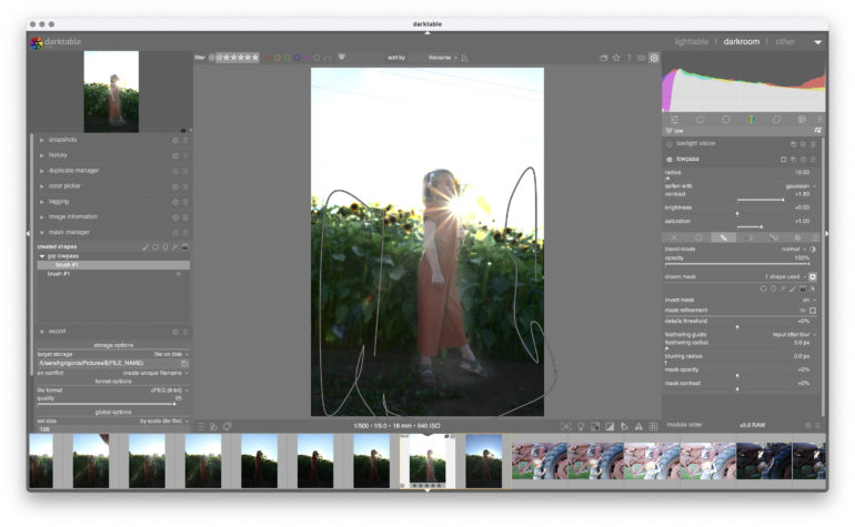
Darktable is an open-source RAW editor similar to Lightroom and Capture One. Despite the free price point, it includes several advanced tools that even those programs don’t have. It also includes a Photoshop-like Liquify tool in the local edits. While dozens of different tools exist, each module can be organized into different workspaces.
If time is money, then darktable is quite expensive. The number of different controls and cluttered user interface gives the program a steep learning curve. The software sits in a weird spot; it’s free, which is likely to attract newbies, yet many of the controls are far too complicated for beginners. That’s exaggerated by a subpar color profiling, which sometimes creates weird highlights before any editing has even started. Ultimately, I got better results from Lightroom or Capture One in much less time.
If you have a lot of time and not a lot of money, play around with darktable. Similarly, if you know what the term white relative exposure means, you’ll be impressed by the advanced modules in an open source platform. But, ultimately, the time required, odd RAW processing, lack of camera color profile support, and slow local edits won’t be worth canceling that Lightroom or Capture One subscription for.
I’m giving darktable two out of five stars. That’s probably too generous, but it is free.

Gear Used
I downloaded darktable on my 2021 Macbook Pro with the M1 Pro processor, with 32 GB of memory and a 2 TB hard drive. I primarily edited RAW photos from the Fujifilm X-T4.
Innovations
Darktable is open-source software that’s built by photographers. It’s a free Lightroom alternative. However, it doesn’t have all the capabilities of Lightroom. It’s not a file manager, and developers said they aren’t planning one in the future either. It does, however, mix some Photoshop-like features inside, including liquefy and gaussian blur. And like Capture One, the workspace can be customized.
Ease of Use
Darktable is divided into two main areas, lightable and darkroom, plus workspaces for prints, maps, slideshows, and tethering. Users will spend the most time in lightable, where photos are organized, and darkroom, where photos are edited.
Lightable
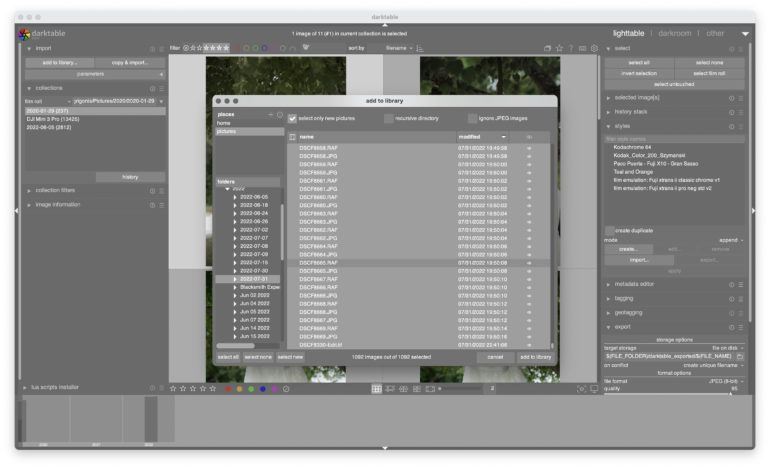
Lightable is the tab inside darktable that’s designed for viewing, rating, and culling images. As an open-source software, the list of supported cameras doesn’t include the most recently listed ones. For example, I couldn’t import photos from the Canon EOS R3. The Nikon Z7 is on the list, but the Z7 II is not.
Darktable does not include a file manager. The app still imports files and can star and color code images. But, it doesn’t allow for organizing photos outside of the file system that they already exist on. There are no collections outside the folders on the hard drive. Photographers can import images from an SD card and choose a folder to save them on. There’s also no option to have a second darktable library like Lightroom allows for multiple separate Libraries. Another annoyance is that there are no previews of the images in the import dialog — you can select images by file name but can’t see exactly what you are importing.
There are several different viewing modes — more, actually, than Lightroom. There’s a thumbnail view, a zoom view that zooms into the thumbnails using the scroll wheel on a mouse, a cull view for comparing images side-by-side, a dynamic cull for viewing more than two images at the same time, and a full preview to click through full-size images one at a time.
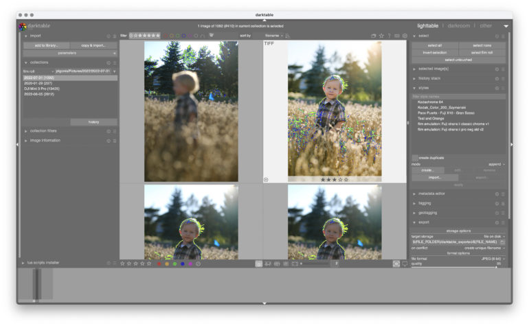
I really loved the focus peaking view option. When I’m culling photos, I can move much faster if I don’t have to look at each one at 100 percent to see which one is sharper. The focus peaking view did sometimes make it hard to determine which image had the best expression, but it was possible to see which photo was in focus looking at just the thumbnails. Lightroom can’t do this without downloading a plug-in.
For culling, there are both stars and color labels, including keyboard shortcuts. Photos can be rejected, but there’s no flag option. Images can then be sorted by clicking all the stars that you want to be displayed, or all the colors.
Darkroom
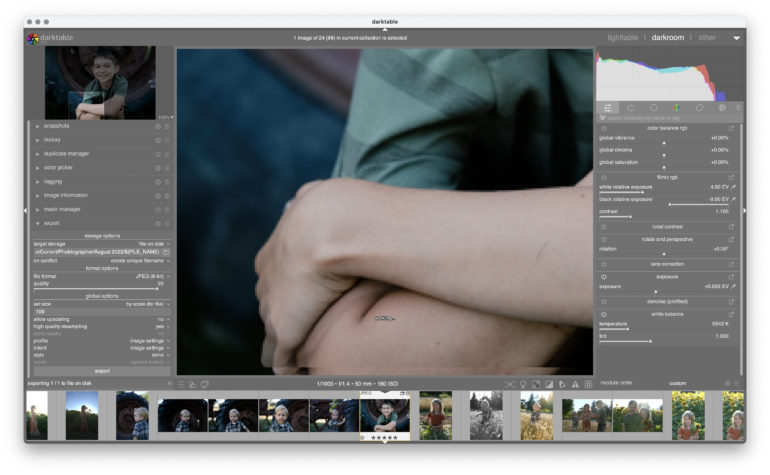
Darkroom is darktable’s tab for editing images.
Like Lightroom, darktable is non-destructive. Images are read-only; a sidecar file is generated with the edits, which can then be applied to the file upon export, creating a new file and leaving the original intact. The software does have some support Lightroom XMP sidecar files, but is limited to certain edits like crop, exposure, clarity, HSL, and a few others.
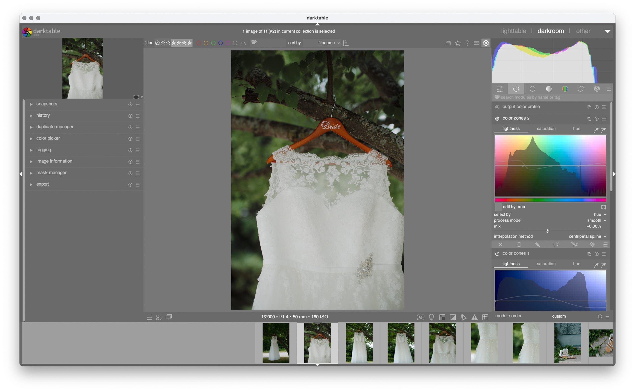
Darkroom is organized with two larger sidebars and a few items in narrower bars above and below the image for sorting images and accessing presets. The lefthand sidebar has things like history, managing duplicates, tagging, and masks.
The right sidebar contains most of the editing controls, organized in tabs. The tabs here can be customized. The first tab, for example, is called quick access, where you’ll put all your favorite controls. There’s also tabs for base edits, color, corrections, and effects. Another tab holds only the active modules in the current image.
There are a surprising number of modules and many things you can do to the image here. But, that’s where I found darktable more complicated to use. There are so many options, often named something a little different than inside other photo editors, that it was hard to find the exact control I was looking for. You can customize what’s shown or use the search bar, but it’s still difficult to find what module you want. For example, there’s an exposure slider, but there’s also white relative exposure and black relative exposure. Photographers who use a light meter might be excited to find those last two, but for beginners, the number of options is overwhelming. And those last two options are still included when the beginner’s workspace is selected.
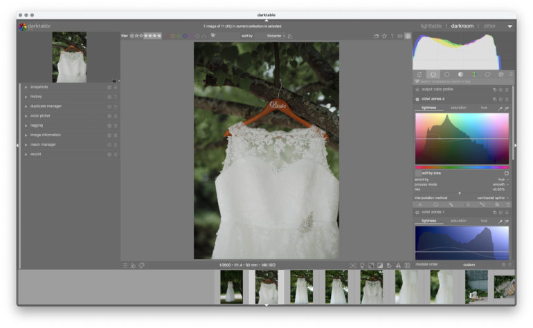
The other aspect I found annoying was that, while you can customize what’s in the quick access panel, you can’t customize the order in which they appear. I’d love to put my most-used at the top. Or, to put the white balance right next to saturation and other color controls. Instead, it’s alphabetized.
I wasn’t expecting a free Lightroom alternative to have more options than the paid photo editor. Controls like color mapping, liquify, bloom, and low pass aren’t inside Lightroom. But, do most photographers need those controls? The naming and the number of different modules give darktable a steep learning curve compared to Capture One, Lightroom CC and even Lightroom Classic.
While I was impressed with darktable’s upload speed, local edits were much slower than other applications on the same computer. Using the heal brush to correct a spot of acne, the screen would say working for several seconds, then would select a different tool, so I had to go back and reselect the brush tool if there were other pimples to deal with. The heal tool feels clunkier and less refined. Masking also doesn’t feel well refined, and highlighting a small area accurately was difficult to do without any smart edge detection. I really missed Lightroom’s new-ish Select Subject tool here. There are better options found in Photoshop, including a liquify tool.
I found darktable much more complex than Lightroom or Capture One. The terminology is different and the way the user interface is organized doesn’t always make sense. The user manual isn’t always clear either. It took a lot of searching to find out how to import downloaded styles because that option was in lightable, where images are organized, and not darkroom, where images are actually edited. Even in the darkroom tab alone, the organization of the modules feels unnecessarily complex. This could be a side effect of the number of different options.
However, the biggest thing that made darktable difficult to use is the lack of support for a camera’s built-in color profiles. I switched to Fuji specifically because I could cut my editing in half by not trying to fix green or red skin tones. The user manual says that you can download and add your camera’s ICC’s but you have to input some code to do so, from the looks of it. I couldn’t figure it out.
Another task that is difficult to do is to apply the settings from one image to another. Darktable allows editors to copy and paste using the traditional control+c and control+v functions. However, this doesn’t allow you to choose what to copy and paste, and there may be unwanted adjustments — like the healing brush or white balance — that you may not want to include when copying those settings over.
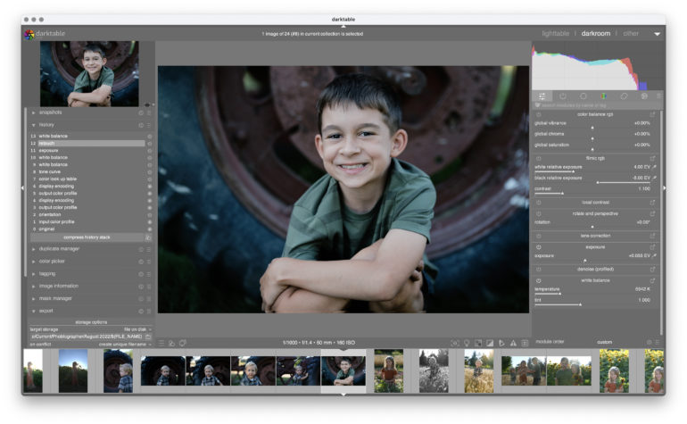
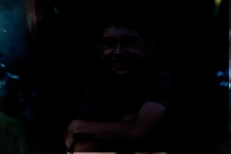
I also had several weird errors I couldn’t figure out. On export, one photo was several stops darker than the photo inside darkroom, using the same export settings of five other photos that looked just fine. I touched no controls, and suddenly one photo skewed towards a green white balance. Two photos looked like a duplicate image had been plaid over the top of the original, giving the bottom a weird edge and some ghosting.

In short, there’s a lot that you can do with the number of different controls. But, the learning curve is steep, and the number of options can make simple adjustments take more time. Factor in a few odd bugs, and getting the desired results can be difficult despite the number of tools.
Performance
When I first imported images into darktable, performance seemed to be pretty fast. Creating previews and a catalog didn’t take long at all, though to be fair, darktable only creates a sidecar file and keeps the file structure the same. Viewing a full-screen preview was also very quick.
However, darktable felt much slower than Capture One and Lightroom when working with local edits. I fixed five freckles and liquefied one t-shirt wrinkle, and everything slowed to a crawl. Darktable recommends these edits for last for that reason (as with other image editors). But, even viewing these images in the lightable tab later is sluggish. The slower local edits and inability to use my camera’s ICC color profiles made editing take much longer than with other programs.
Image Quality
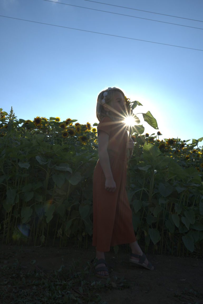
When working with high-contrast images, there’s something a bit wonky about the default RAW processing on darktable. Before I’ve even touched anything, the highlights in this photo look awful. The same image converted to a DNG also looked identically alien. Here’s the untouched RAW:
And here’s the same untouched RAW but exported from Lightroom:
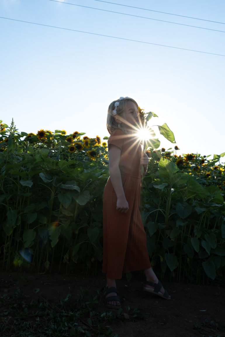
There’s a weird gradation to the highlights around the sun. Yes, the sky is darker and bluer in darktable, but the gradation on the hotspot is so awful I couldn’t manage to edit it out. I spent way too much time trying to find a fix, and I couldn’t. I’m not saying there isn’t one: there are many tools in darktable, and I’m not going to lie and pretend I understand all of them. But, in less than two minutes, I got a much better result in Lightroom (which also has Fujifilm’s color profiles at the ready). The highlights have an ugly edge to them, and recovering the highlights wasn’t as nice as the result Lightroom achieved in less time.


Different algorithms can play a role in image quality, particularly in noise reduction. Darktable has a denoise algorithm that is based on the camera sensor. When editing the same photo in Lightroom, however, darktable had a bit more color noise in the deepest shadows. The result wasn’t awful, but I did prefer the results from using Lightroom’s noise reduction sliders.
The other factor that plays into image quality is simply time. I think I could have gotten some really nice colors playing and experimenting with all the different tools. But, I’m a photographer not a photo editor. Why spend five hours trying to imitate the colors on my Fuji JPEGs?
Darktable has a long list of tools, but other apps have a head start as untouched RAW files looked better in Lightroom than it did in darktable. I got some decent results on photos without a lot of contrast.


Who Should Buy It?
Well, no one should buy it because darktable is free. But is it worth a free download? The open-source software has a lot of advanced options and even mixes some Photoshop-like tools into a program that’s more in line with Lightroom. I love the focus peaking view for culling images, and loading photos is pretty quick. Of course, it’s also hard to argue with the free price point.
However, time is money for professional photographers, and I can get much better results using Lightroom or Capture One in much less time. The steep learning curve, oddities in the RAW processing, and slower local editing performance isn’t worth saving the $10 a month.
Try darktable if you have a lot of time but little money and a durable computer that can afford being thrown across the room. If you don’t have a lot of time but a little bit of money, there are much better options out there.
darktable Tech Specs and Main Features
The darktable website lists the following features:
- Non-destructive editing throughout the complete workflow, your original images are never modified.
- Take advantage of the real power of raw: All darktable core functions operate on 4×32-bit floating point pixel buffers, enabling SSE instructions for speedups.
- GPU accelerated image processing: many image opertions are lightning fast thanks to OpenCL support (runtime detection and enabling).
- Professional color management: darktable is fully color managed, supporting automatic display profile detection on most systems, including built-in ICC profile support for sRGB, Adobe RGB, XYZ and linear RGB color spaces.
- Cross platform: darktable runs on Linux, Mac OS X / macports, BSD, Windows and Solaris 11 / GNOME.
- Filtering and sorting: search your image collections by tags, image rating (stars), color labels and many more, use flexible database queries on all metadata of your images.
- Image formats: darktable can import a variety of standard, raw and high dynamic range image formats (e.g. JPEG, CR2, NEF, HDR, PFM, RAF … ).
- Zero-latency, zoomable user interface: through multi-level software caches darktable provides a fluid experience.
- Tethered shooting: support for instrumentation of your camera with live view for some camera brands.
- Speaks your language: darktable currently comes with 21 translations: Albanian, Catalan, Czech, Danish, Dutch, French, German, Greek, Hebrew, Hungarian, Italian, Japanese, Polish, Portuguese (Brazilian and Portuguese), Russian, Slovak, Slovenian, Spanish, Swedish, Ukrainian.
- Powerful export system supports Piwigo webalbums, disk storage, 1:1 copy, email attachments and can generate a simple html-based web gallery. darktable allows you to export to low dynamic range (JPEG, PNG, TIFF), 16-bit (PPM, TIFF), or linear high dynamic range (PFM, EXR) images.
- Never lose your image development settings darktable uses both XMP sidecar files as well as its fast database for saving metadata and processing settings. All Exif data is read and written using libexiv2.
- Automate repetitive tasks: Many aspects of darktable can be scripted in Lua.
The Phoblographer may receive affiliate compensation for products purchased using links in this blog post.


Leave a Reply